Matplotlib
Contents
3.1. Matplotlib#
3.1.1. Twin axes in Matplotlib#
Did you know that you can have twin axes in Matplotlib? Adding a second XAxis or YAxis can take your time series plots to a whole new level👇
3.1.2. Scatterplot masterclass#
Matplotlib default styles suck. Especially, the look of the left one is revolting.
But, you can take some steps to transform it completely.
Here are they:
Lower opacity - alpha
Lower marker size - only accessible through the “plot” function
Here, you will see that values were rounded off at integer values so, the data is grouped into rows and columns. So, step 3 would be:
Jittering the heights and weights.
Zooming into the center of the plot.
Jittering is a nifty little trick to introduce some noise to the data and prevent overplotting. I learned this scatterplot example in one of DataCamp’s excellent courses.
3.1.3. Labelling the heights of bars in bar charts#
Most of the details on a bar chart is clutter.
Bar charts only need one of the axis labels, an informative title and the height of the bars. The rest goes to the bin. Here is a trick to label the heights of bars in Matplotlib. The rest should be easy👇
3.1.4. autofmt_xdate() to automatically format dates in Matplotlib#
Did it ever happen to you when you visualized a time series, the dates on the XAxis got smooshed together making them illegible? You can avoid that by calling the “autofmt_xdate()” function on the figure object to automatically format date labels in Matplotlib.
3.1.5. How to choose correct DPI and figure size in Matplotlib#
How to choose a correct DPI and figure size in Matplotlib so you don’t lose quality by zooming in?
Matplotlib sets figure size in inches - figsize of (12, 6) is 12 inches wide and 6 inches tall.
The DPI represents dots or pixels per inch. The default DPI of 100 means for a figsize of (12, 6), the image resolution will be 1200x600 pixels.
Now, there is also the size of the points, lines or other elements in a plot. Those are measured in points per inch - there are 72 points in an inch. So, in a DPI of 72, a single dot would have the area of a single pixel.
At 144 DPI, the dot would be two pixels or a line would be two pixels thick. So, DPI is like a magnifying glass - a higher DPI scales all elements in a plot.
So, to not lose image quality when zooming in, increase DPI while keeping the figsize constant.
Image and content credit: an SO thread down below👇
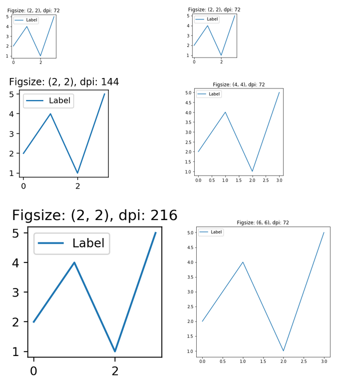
StackOverflow thread on the topic: https://bit.ly/3IrsLjY
3.1.6. Visualize all trees of RandomForest#
It would be freakishly cool to visualize all the trees in a Random Forest. But how?
Last time, I showed how you can draw a single Decision Tree using PyBaobabdt package using Sankey diagrams. To visualize multiple trees of a RandomForest, we can use Matplotlib subplots like below.
Just remember to set high DPI and high figure size before saving.
Image credit: Pybaobabdt docs. Code to create the plot is down below👇
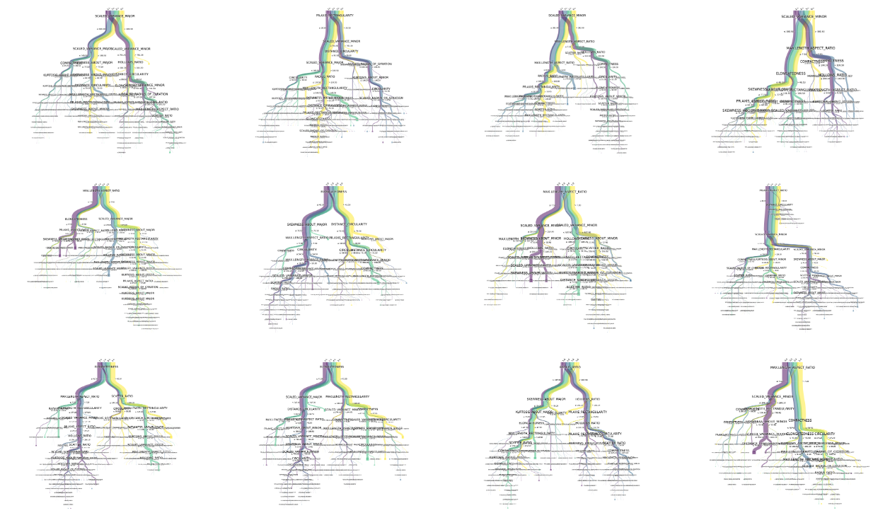
Pybaobabdt docs: https://bit.ly/3unYtJc
Code to generate the plot: https://bit.ly/3yT9CUV
3.1.7. Venn diagrams in Python#
Drawing Venn diagrams in Matplotlib!
Matplotlib is built upon tiny moving classes called Artists. Everything is an artist in Matplotlib - each dot, circle, line, text, spine, etc. They all inherit from a base class called Artist.
If you use these Artists correctly you can draw practically everything in Matplotlib (even the Mandelbrot set). matplotlib_venn is a library that takes advantage of this feature and allows you to plot Venn diagrams.
Link to the library in the first comment.
The library: https://github.com/konstantint/matplotlib-venn
3.1.8. Anatomy of Matplotlib#
A plot that is worth a thousand plots.
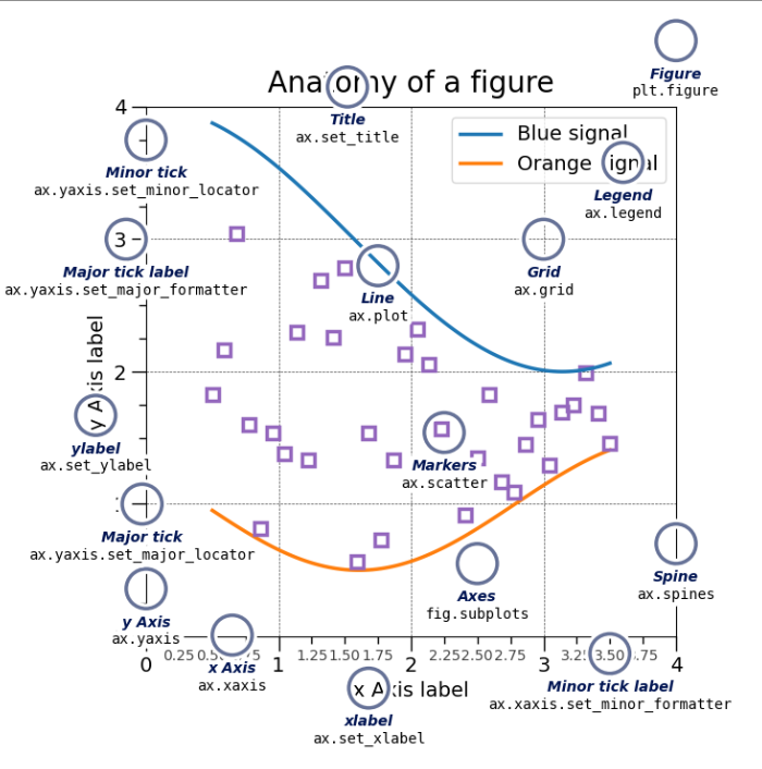
Source: https://bit.ly/3P6gq6H